A full-stack analytics engineer is a critical member of the data org. They talk to business stakeholders to help them take a pulse on the business. And through conversation with them, they gain understanding of who/what they are trying to measure and why. Then they translate that into a data question, reaching into the data warehouse and grabbing the necessary data, transforming it to model business logic and presenting answer to business stakeholder’s question with charts on a dashboard.
For this project, I tackled a business question brought up in the Energy AI space. Fluence Digital is an AI company that creates software for economic optimization at the portfolio level. Energy price predictions are made and compared to competing market operators’ predictions. The more accurate the prediction, the greater return on ROI for those in the energy market. That is why key question for Fluence Digital is: How accurate are our predictive models?
A business stakeholder from Fluence would probably ask something on the lines of, “Whose forecast is better, ours or the market operators?” With this question, I was given a year’s worth of data on the actual price of energy ($/kWh), Fluence’s predictions and Market Operators’ predictions to answer the question. And all ETL, analysis had reporting had to be done in Python/SQL. The final deliverable would be a deployed web app with a link given to the stakeholder to view and interact with my analytic conclusion.
Extraction, Transformation and Load (ETL)
My data was stored in a Snowflake instance.
Extraction
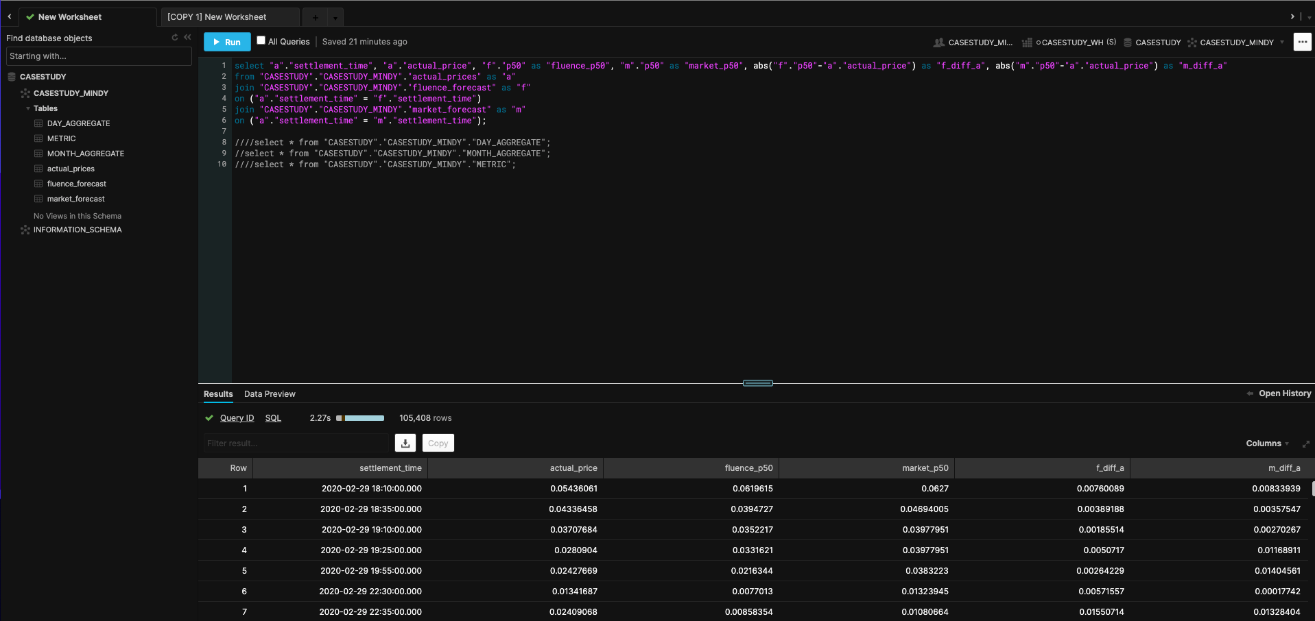
The tables had in common settlement_time and p50 prediction columns. I joined all tables on settlement_time using SQL which was written in Kaggle Notebooks, cloud computational environments that enable reproducible and collaborative analysis. I prefer using these notebooks since I can write Python and use Kaggle’s reliable computational power. I usually don’t get Python package conflicts while using it and notebooks are pre-loaded with all data science libraries. In order to pull the data programmatically from Snowflake environment into a Python one, there were three options: a custom Python script, Snowflake’s Python Connector library or SQLAlchemy. I ended up using SQLAlchemy Python library because it required few lines of code to complete the job and produced no run errors upon execution. SQLAlchemy transformed a Snowflake data table into a Python object. In particular, the desired output would be a Pandas dataframe. This would allow transformations to the joined tables.
Transformation
In order to help answer the business question, a “better” metric had to be decided on in order to compare the two different forecasts. Given that these forecasts were time series forecasts, the usual measures are RMSE and MAE. RMSE is usually the metric of choice because when you are optimizing a forecast’s lost function, you want to be able to quickly inspect where to optimize. And between RMSE and MAE, RMSE’s loss function has a concave curve that makes it easier to detect where to optimize. Also, RMSE penalizes error more (10 $/kWh from actual value is far greater than 5 $/kWh from actual value). A typical statistical library used to compute model performance was used to create a metrics table. This table included prediction source (Fluence or market op’s), horizon (365 days), rmse and mae values.
From the base table, two columns were added: difference of Fluence predictions from actual price and the same for market op’s predictions. I had to put on the business stakeholder cap and think about how they would best understand how to determine the best forecast besides a metric’s results telling them. One way to understand data is to summarize it in pictures/visualizations. Conclusions on data can be made much quicker from graphs than straight numbers. This is why I decided to calculate the difference columns. Last two tables made were daily and monthly aggregations of the table with the difference columns.
Load
After creating the metrics table and updating the base data model with prediction differences from actual price values and aggregated versions of that table, I loaded these tables back into the Snowflake warehouse using SQLAlchemy’s library again.
Business Intelligence Visualization
In order to provide business stakeholder with interactive visualizations, I decided to go with Plotly library since it has built-in interactivity. You can hover over graphs for details, pan in and out, look at multiple hovers at once, etc. It allows the user to look at different angles of the data from one graph versus multiple snapshots of the same summarized data. I wanted to produce 4 different visualizations to help answer the business question:
- Forecast differences from Actual (Fluence vs. Market Operators)
- Both forecasts against Actual prices
- Montly aggregate of both forecasts against Actual prices
- Daily aggregate of both forecasts against Actual prices
The first two graphs had some more interactive buttons in order to condense the time axis to hour, day, month and 6 month level of data. Also, there was a range slider in order to segment a window of time for viewing.
https://user-images.githubusercontent.com/12889138/123158227-5b419a00-d420-11eb-8d79-dd1b389ae251.mov
Web Application Development and Deployment
The last step was to create a web application that could be deployed so the business stakeholder could get a link to see data, interact with graphs and read the data story to understand how the analytic conclusion was made. And this would add to their own take on the data and tell a story of their own. In order to develop my web app and deploy it, the choices were Plotly Dash and Heroku or Plotly graphs and Streamlit. I went with the second option because I was already familiar with Streamlit and it had a huge number of Github contributors. So app development was straight forward and code was light.
For deployment, that was even simpler because all I had to do was request an invite for Streamlit Sharing capabilities. Then all I had to do was provide the Github repo to point to. The repo included my web app Python script and a requirements.txt to specify packages needed to build the app and everything else was spun up by Streamlit. And within a few minutes my app was deployed on the web with a URL I shared with my business stakeholder. Get a quick preview below or even better: check it out yourself here!
https://user-images.githubusercontent.com/12889138/123044053-06653b80-d3ae-11eb-8ea1-8d5ed3a1f0e2.mov
Conclusion
The metrics table showed the predictions with the lowest RMSE and lowest MAE was Fluence’s forecast. And visualizations showed that Fluence’s difference from actual price values had most values closest to 0 and its affinity to the actual price graph was greater compared to market operators’ graph. Thus, Fluence forecasts were better!
Some concluding thoughts on implementation: good to have multiple options when implementing whether it be for the ETL, visualization or development and deployment step. The best tools to answer the business stakeholders were the tools I chose due to meeting or going above requirements. At the same time, in a business context and especially at a start-up, when you need to factor in maintainability and time to execute and deliver, the best solution may be second best. However, the job got done!